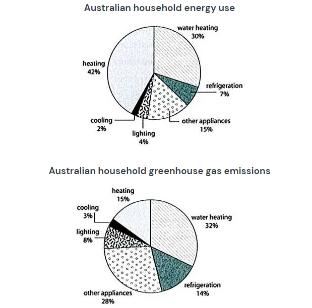

The first pie chart illustrates energy consumption in the average Australian household. Meanwhile, the second chart demonstrates the amount of gas emitted due to energy use.
Overall, heating and water heating are the two power that make up a remarkable percentage of energy use, while most greenhouse gas emissions come from water heating and other appliances.
Looking at the first chart, the energy that Australian households use the most is water heating and heating, at 30% and 42%, respectively. However, only 2%, 4%. and 7% of the energy used is cooling, lighting and refrigeration, respectively. Other appliances account for 15%, the third figure in the chart.
In the second chart, water heating and other appliances are the two most consumed energy sources of greenhouse gas emissions, at 32% and 28%, respectively. Heating and refrigeration account for similar proportions, at levels of 15% and 14%, respectively. On the contrary, greenhouse gas emissions come from cooling and lighting, which are only at 2% and 8%, respectively.